In 2022, Bestow began to rethink who we were and how we lived our mission. In addition to being an innovator in the direct-to-consumer life insurance space, we knew we could offer our tech to the big legacy carriers and help expand access to life insurance. When your start-up starts growing up, so must your brand. This is a sneak peek at how we evolved ours.
Tone
We were often witty (some might even say weird) with our D2C consumers. But
for legacy insurance carriers, we needed a little more gravitas. While keeping
the common threads of relatability and approachability, we defined a more
purposeful, straightforward voice for B2B customers. And we were able to build
a cohesive new website that catered to both audiences.
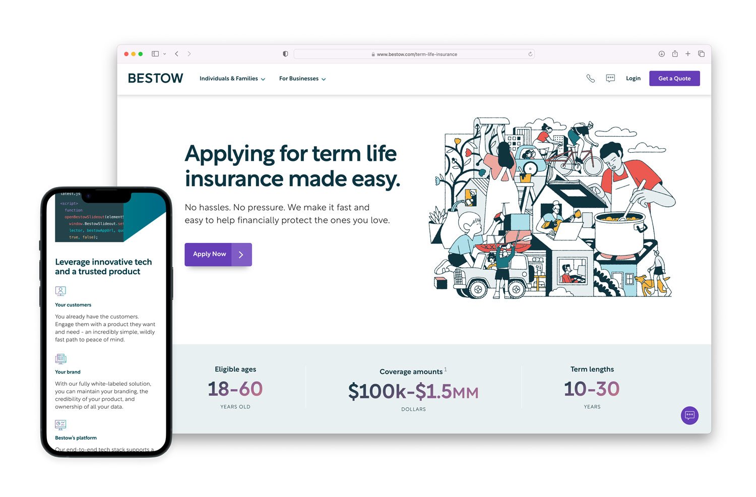
Website
Like all website relaunches, there were long and intense talks about the architecture, research, and wireframes. But the fun really began when we pitched it to Varvet and they instantly understood what we wanted to achieve. Make B2B SaaS fun, friendly, and impressive - without alienating our direct consumers.
We aimed to bring the pages to life through the use of animations, illustrations, and an eye-catching color scheme. The animations serve to provide a dynamic experience for the user, helping to guide them through the site and draw their attention to key areas.
By creating a separate but united color scheme for our consumer and enterprise identities, we were able to differentiate the two in a subtle but impactful way.
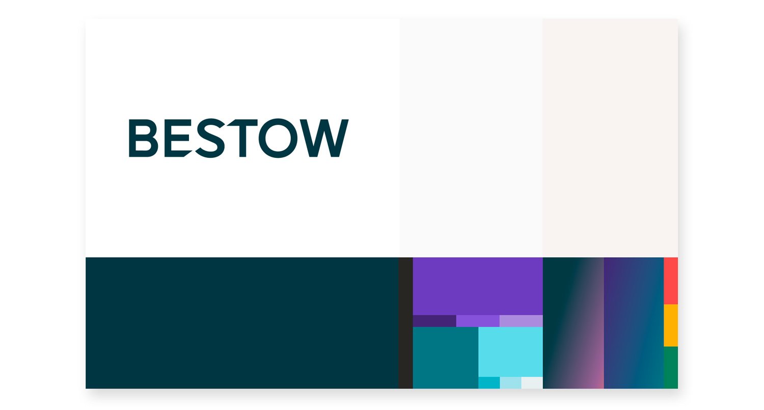
Color
Still rooted in our legacy navy blue, we’ve introduced more vibrant and modern hues and added gradients to the palette. The result was a carefully curated, eye-popping collection of accents that drives the eye across the most important part of the page.
Our color selection process involved exploring several experimental palettes before arriving at the final one. The standout color was our bold purple, which sparked a lot of debate within the team. Initially, we considered more muted options, but they lacked the visual impact we were seeking for our call-to-actions.
Ultimately, we chose a shade that has been affectionately nicknamed "Grimace," inspired both by a beloved fast food character and our VP of Brands' initial reaction.
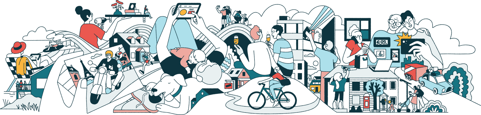
Illustration
We partnered with illustrator Chris DeLorenzo, who we’ve admired for a while. It was such a treat to collaborate with someone who immediately understood what we were trying to achieve. The result is a library of intricately detailed stories of the chaos of modern life.
Each illustration has stories within a story that go beyond the typical cliches of parenthood and home ownership. Additional spot illustrations and icons were built by our in-house brand design team.

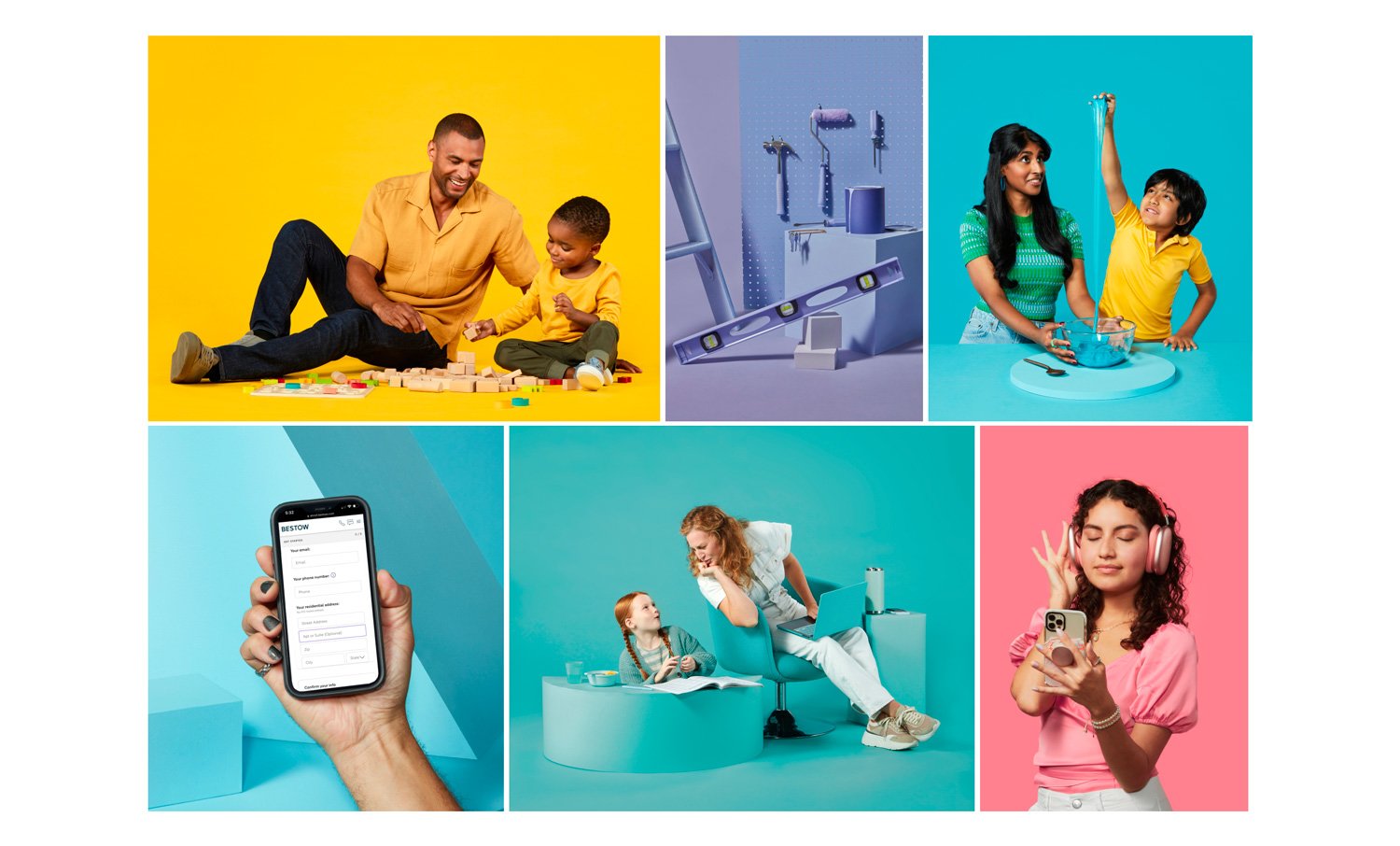
Photography
With a fresh new color palette and desire to eliminate generic stock photography from our lives, we shot a library of both still life and portrait photography. We found the perfect duo in Austin-based photographers Dave Creaney and Nick Cabrera. For two busy days in the Austin heat, our brand team was thrifting, borrowing, building, spray painting and more to capture the perfect shots.